public Bitmap cropImage(Bitmap image, int x, int y, int width, int height) {
    Bitmap result = new Bitmap(width, height);
    Graphics g = new Graphics(result);
    g.drawBitmap(0, 0, width, height, image, x, y);
    return result;
}martes, 28 de febrero de 2012
BlackBerry: Cropping images
Blackberry: Using along with fingerprint device - YouTube
La policía de UK usa un scanner de huellas dactilares acomodado en una cajita junto con una BlackBerry para pasarle la imágen a su base de datos ONLINE y recuperar la identidad de la persona investigada en cuestión de minutos.
Esto está bien, pero mucho mejor si le damos a los automóviles un TAG RFID (inclusive a la persona) para ni siquiera molestarla en pedirle las huellas.
Si, entiendo. Alguien podría tener el TAG de otra persona... Pero, si le vemos la cara y yo comunico ese ID del TAG y lo que veo como resultado desde la base de datos de la policía es otra cara diferente a la que veo, entonces la pena es doble.
Ideas, ideas... Todo esto nos lleva a la esclavitud, en este imbécil mundo del dinero.
lunes, 27 de febrero de 2012
Picture scroll field - UI Component
Code sample: Creating a picture scroll field
sábado, 25 de febrero de 2012
ANDROID - Showing webview in a popup
public void showMapPopUp(String url){ try{ Dialog dialog = new Dialog(Locations.this); LayoutInflater inflater = (LayoutInflater)getSystemService(Locations.this.LAYOUT_INFLATER_SERVICE); View vi = inflater.inflate(R.layout.link_popup, null); dialog.setContentView(vi); dialog.setTitle("My Title"); dialog.setCancelable(true); WebView wb = (WebView) vi.findViewById(R.id.WebView01); wb.loadUrl(url); wb.setWebViewClient(new MyWebViewClient()); dialog.show(); }catch(Exception e){ System.out.println("Exception while showing PopUp : " + e.getMessage()); } } private class MyWebViewClient extends WebViewClient { public boolean shouldOverrideUrlLoading(WebView view, String url) { view.loadUrl(url); return true; } }link_popup.xml
jueves, 23 de febrero de 2012
Browser ID
Está interesante ahora porque Mozilla ya lo comenzó a usar en "Mozilla Persona" y eso le da seriedad al asunto.
Browser ID es como "Facebook Connect" o "Twitter Connect" o "Google Connect", pero la ventaja es que no necesitas un usuario en ninguna red social para identificarte en un sitio... Solamente el usuario que tenga una cuenta en BrowserId.org se puede validar en un sitio (o aplicación mobile) que lo soporte.
Para desarrolladores es súper fácil. Basta con enviar un query al sitio (con un token que te devuelve BrowserId al momento de validarte) y te responde un JSON con los datos del mismo, si es que existe realmente.
https://github.com/mozilla/browserid/wiki/How-to-Use-BrowserID-on-Your-Site
Me parece piola para recomendar a los clientes, como para no andar luchando con tanto login de red social.
Además, tal vez hasta lo implementen las redes sociales, si es que los desarrolladores hacemos puja para que eso pase ;-)
https://browserid.org/about
miércoles, 22 de febrero de 2012
BlackBerry code for a rounded rectangle with gradient fill
This article includes sample Java code that creates a gradient-filled rounded rectangle on a BlackBerry device. Big Deal you say. Before I actually tried to do this, I wouldn't have rubbed two brain cells together worrying about it. But then I spent days trying to figure out how RIM'sGraphics.drawShadedFilledPath() method works so that I could make a good-looking button.
What it looks like
Here's what the example code below ends up looking like:

Here's the entire code example for your cuttage/pastage. I'll explain the important parts after you skim through.
import net.rim.device.api.ui.*; import net.rim.device.api.ui.container.*; import net.rim.device.api.ui.component.*; import net.rim.device.api.ui.decor.*; // Our application. public class RoundedRectWithGradient extends UiApplication { // Entry point. public static void main(String[] args) { RoundedRectWithGradient theApp = new RoundedRectWithGradient(); theApp.enterEventDispatcher(); } // Display the rounded rect demo screen when the app starts. public RoundedRectWithGradient() { pushScreen(new DemoScreen()); } // Simple demo screen with a title and a rounded rectangle with gradient. class DemoScreen extends MainScreen { public DemoScreen() { super(DEFAULT_CLOSE | DEFAULT_MENU); setTitle("Rounded Rectangle with Gradient"); VerticalFieldManager vfm = (VerticalFieldManager) getMainManager(); vfm.setBackground(BackgroundFactory.createSolidBackground(0xFFFFFF)); LabelField spacer = new LabelField("", USE_ALL_WIDTH); vfm.add(spacer); RoundedRectField rrField = new RoundedRectField(); vfm.add(rrField); } } } // Extending field to display a rounded rectangle with a gradient. class RoundedRectField extends Field { // Layout values private static final int CURVE_X = 12; // X-axis inset of curve private static final int CURVE_Y = 12; // Y-axis inset of curve private static final int MARGIN = 2; // Space within component boundary // Static colors private static final int TEXT_COLOR = 0xFFFFFF; // White private static final int BORDER_COLOR = 0x4A4A4A; // dark gray private static final int BACKGROUND_COLOR = 0xFFFFFF; // White // Point types array for rounded rectangle. Each point type // corresponds to one of the colors in the colors array. The // space marks the division between points on the top half of // the rectangle and those on the bottom. private static final byte[] PATH_POINT_TYPES = { Graphics.CURVEDPATH_END_POINT, Graphics.CURVEDPATH_QUADRATIC_BEZIER_CONTROL_POINT, Graphics.CURVEDPATH_END_POINT, Graphics.CURVEDPATH_END_POINT, Graphics.CURVEDPATH_QUADRATIC_BEZIER_CONTROL_POINT, Graphics.CURVEDPATH_END_POINT, Graphics.CURVEDPATH_END_POINT, Graphics.CURVEDPATH_QUADRATIC_BEZIER_CONTROL_POINT, Graphics.CURVEDPATH_END_POINT, Graphics.CURVEDPATH_END_POINT, Graphics.CURVEDPATH_QUADRATIC_BEZIER_CONTROL_POINT, Graphics.CURVEDPATH_END_POINT, }; // Colors array for rounded rectangle gradient. Each color corresponds // to one of the points in the point types array. Top light, bottom black. private static final int[] PATH_GRADIENT = { 0xAAAAAA, 0xAAAAAA, 0xAAAAAA, 0xAAAAAA, 0xAAAAAA, 0xAAAAAA, 0x000000, 0x000000, 0x000000, 0x000000, 0x000000, 0x000000 }; // Center our readonly field in the space we're given. public RoundedRectField() { super(FIELD_HCENTER | FIELD_VCENTER | READONLY); } // This field in this demo has a fixed height. public int getPreferredHeight() { return 70; } // This field in this demo has a fixed width. public int getPreferredWidth() { return 240; } // When layout is requested, return our height and width. protected void layout (int width, int height) { setExtent(getPreferredWidth(), getPreferredHeight()); } // When painting is requested, do it ourselves. protected void paint(Graphics g) { // Clear this area to white background, fully opaque. g.clear(); g.setGlobalAlpha(255); g.setBackgroundColor(BACKGROUND_COLOR); // Drawing within our margin. int width = getPreferredWidth() - (MARGIN * 2); int height = getPreferredHeight() - (MARGIN * 2); // Compute paths for the rounded rectangle. The 1st point (0) is on the left // side, right where the curve in the top left corner starts. So the top left // corner is point 1. These points correspond to our static arrays. int[] xPts = { 0, 0, CURVE_X, width - CURVE_X, width, width, width, width, width - CURVE_X, CURVE_X, 0, 0 }; int[] yPts = { CURVE_Y, 0, 0, 0, 0, CURVE_Y, height - CURVE_Y, height, height, height, height, height - CURVE_Y }; // Draw the gradient fill. g.drawShadedFilledPath(xPts, yPts, PATH_POINT_TYPES, PATH_GRADIENT, null); // Draw a rounded rectangle for the outline. // I think that drawRoundRect looks better than drawPathOutline. g.setColor(BORDER_COLOR); g.drawRoundRect(0, 0, width, height, CURVE_X * 2, CURVE_Y * 2); // Place some text in the center. String someText = "Some Text"; Font font = Font.getDefault().derive(Font.PLAIN, 9, Ui.UNITS_pt); int textWidth = font.getAdvance(someText); int textHeight = font.getHeight(); g.setColor(TEXT_COLOR); g.setFont(font); g.drawText(someText, (width / 2) - (textWidth / 2) - MARGIN, (height / 2) - (textHeight / 2) - MARGIN); } } Once over lightly
Ok there's a lot of code here. BlackBerry programmers will recognize the first bit as a standard screen, without much going on. The RoundedRectField class is the bit we want to pay attention to. This extends the Field class from the BlackBerry API.
The RoundedRectField starts out with some strange-looking arrays. We'll come back to them in a minute; they're the really weird stuff here. The constructor sets a couple of simple styles to center the field in the available space. We give the field a fixed height and width for this example. Then comes a low-level paint function; this draws the rounded gradient-filled rectangle into the current Graphics context, then outlines it, and finally paints some text in the middle.
My rectangle has twelve points
I kept trying and failing to get what I wanted out of drawShadedFilledPath() because I thought that, since rectangles had four corners, I needed to feed the method an array of four points. Ah, but little did I know that in Ottawa, where the BlackBerry comes from, rounded gradient-filled rectangles have twelve points. I'll have to visit someday just to check the place out and see what it looks like; maybe their stop signs have 24 corners. This illustration shows where the points are found:

Since this is Java programming, we start counting at 0. You'll notice that point zero starts on the side, right where the curve begins. Why don't we start where point 1 is, in the upper left corner? Because if we do, the drawShadedFilledPath() call will fail. We need to use a point type for the corners (where we're not even going to draw anything) that can't be at the beginning or end of the point types array. So my convention has become to start just below the upper left corner, where the point type permits starting and ending.
Let's take another look at the point types array now. The four instances of Graphics.CURVEDPATH_QUADRATIC_BEZIER_CONTROL_POINT indicate the four corners (points 1, 4, 7, and 10). The rectangle is drawn beginning with the Graphics.CURVEDPATH_END_POINT at point 0. And no, I haven't the faintest clue what aCURVEDPATH_QUADRATIC_BEZIER_CONTROL_POINT is. I just work here.
private static final byte[] PATH_POINT_TYPES = { Graphics.CURVEDPATH_END_POINT, Graphics.CURVEDPATH_QUADRATIC_BEZIER_CONTROL_POINT, Graphics.CURVEDPATH_END_POINT, Graphics.CURVEDPATH_END_POINT, Graphics.CURVEDPATH_QUADRATIC_BEZIER_CONTROL_POINT, Graphics.CURVEDPATH_END_POINT, Graphics.CURVEDPATH_END_POINT, Graphics.CURVEDPATH_QUADRATIC_BEZIER_CONTROL_POINT, Graphics.CURVEDPATH_END_POINT, Graphics.CURVEDPATH_END_POINT, Graphics.CURVEDPATH_QUADRATIC_BEZIER_CONTROL_POINT, Graphics.CURVEDPATH_END_POINT, }; Another little convention of mine is to leave a blank link between the top and bottom halves of the array, so I won't have to take my shoes off to count when I'm trying to fix something.
More twelve-pointed stuff
Our drawShadedFilledPath() method takes some other array based arguments too. These need to contain the exact same number of points as the Ottawa Rectangle of point types does. So here's the twelve-pointed array of colors in our gradient. The color at point 0 in this array is applied to the point type at point 0 in the array we just looked at.
private static final int[] PATH_GRADIENT = { 0xAAAAAA, 0xAAAAAA, 0xAAAAAA, 0xAAAAAA, 0xAAAAAA, 0xAAAAAA, 0x000000, 0x000000, 0x000000, 0x000000, 0x000000, 0x000000 }; There are two more twelve-pointed arrays we need, one for points on the X-axis, the other for points on the Y-axis. Trying to keep X,Y points straight when broken off into separate arrays drove me right round the bend, maybe you're better at this sort of thing than I am. What I did to make things a little more flexible was to rely on a couple of layout constants to help me shape the curve:
private static final int CURVE_X = 12; // X-axis inset of curve private static final int CURVE_Y = 12; // Y-axis inset of curve private static final int MARGIN = 2; // Space within component boundary
The X-axis array also starts at point 0 in our diagram. The width variable is set at the top of the paint function to give us a bit of margin on the sides. The top line of thexPts array below defines the X-axis location of points 0 through 5, the bottom, points 6 through 11.
int[] xPts = { 0, 0, CURVE_X, width - CURVE_X, width, width, width, width, width - CURVE_X, CURVE_X, 0, 0 }; The Y-axis array works the same way. The height variable is set at the top of the paint function to incorporate a little bit of margin. Again, start with point 0 in the diagram and work your way around:
int[] yPts = { CURVE_Y, 0, 0, 0, 0, CURVE_Y, height - CURVE_Y, height, height, height, height, height - CURVE_Y }; Big anticlimax
So we now have arrays containing X-axis locations, Y-axis locations, point types, and colors at each point. Each of these arrays has the exact same number of members; add an extra or leave one out and Bad Things happen, and you'll go crazy trying to figure out just what. So, at last, here's how to draw a gradient filled rounded rectangle on a BlackBerry screen:
g.drawShadedFilledPath(xPts, yPts, PATH_POINT_TYPES, PATH_GRADIENT, null);
There's one more argument that also takes an array of something or other, but I wasn't able to figure that one out and didn't seem to need it. I'll leave it as an exercise for you.
Final notes
I tried using a drawPathOutline() call to create a border around the rounded rectangle, but it didn't look very good to my eyes. I used drawRoundRect instead. Try them both and see what you think.
If you want a peek at what I did with this hard-won knowledge, check out the WAVE Mobile Communicator for BlackBerry. At the moment, it's featured on theTwisted Pair homepage. I used this same sort of drawing code for the big green (or red, or gray, depending) Talk button in the center of the screen when I prototyped the user interface.
Ok, hope this helps somebody. Have fun, and say hi to any twelve-pointed Ottawa Rectangles you run across.
Customize Android Fonts
Every Android device comes with a collection of standard fonts: Droid Sans, Droid Sans Mono and Droid Serif. They were designed to be optimal for mobile displays, so these are the three fonts you will be working with most of the time and they can be styled using a handful of XML attributes. You might, however, see the need to use custom fonts for special purposes. We’ll be taking a look at that as well in this quick tip.
Font Style Attributes
In the following section we’re going to examine the different XML attributes that you can use to style components with text. If you wish to follow along, then setup a new Android project in your IDE of choice and open up your main.xml layout file.
Typeface
As stated in the overview, there are three different default typefaces which are known as the Droid family of fonts: sans, monospace and serif. You can specify any one of them as the value for the android:typefaceattribute in the XML declaration of a component that supports text styling, such as TextView. Here’s an example of all three typefaces in action:
- xml version="1.0" encoding="utf-8"?>
- <LinearLayout xmlns:android="http://schemas.android.com/apk/res/android"
- android:orientation="vertical"
- android:layout_width="fill_parent"
- android:layout_height="fill_parent"
- >
- <TextView
- android:layout_width="fill_parent"
- android:layout_height="wrap_content"
- android:text="This is a 'sans' demo!"
- android:typeface="sans"
- />
- <TextView
- android:layout_width="fill_parent"
- android:layout_height="wrap_content"
- android:text="This is a 'serif' demo!"
- android:typeface="serif"
- />
- <TextView
- android:layout_width="fill_parent"
- android:layout_height="wrap_content"
- android:text="This is a 'monospace' demo!"
- android:typeface="monospace"
- />
- LinearLayout>
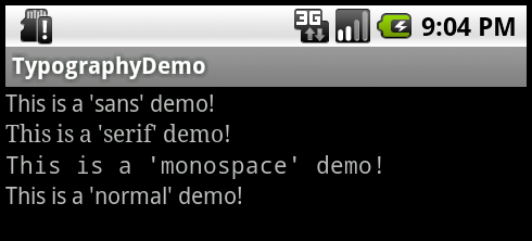
In addition to the above, there is another attribute value named “normal” which defaults to the sans typeface.
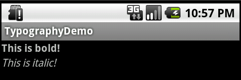
Text Style
The android:textStyle attribute can be used to put emphasis on text. The possible values are: normal, bold, italic. You can also specify bold|italic.
- <TextView
- android:layout_width="fill_parent"
- android:layout_height="wrap_content"
- android:text="This is bold!"
- android:textStyle="bold"
- />
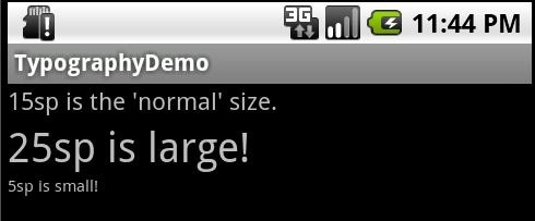
Text Size
android:textSize specifies the font size. Its value must consist of two parts: a floating-point number followed by a unit. Available units are: sp (scaled pixels), px (pixels), dp (density-independent pixels), in (inches), mm (millimeters). It is generally a good practice to use the sp unit so the size can scale depending on user settings.
- <TextView
- android:layout_width="fill_parent"
- android:layout_height="wrap_content"
- android:text="15sp is the 'normal' size."
- android:textSize="15sp"
- />
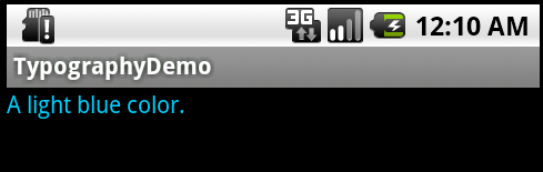
Text Color
The android:textColor attribute’s value is a hexadecimal RGB value with an optional alpha channel, similar to what’s found in CSS and can be in one of the following formats:
- #RGB
- #ARGB
- #RRGGBB
- #AARRGGBB
You can also reference a color declaration using @color/color_name.
- <TextView
- android:layout_width="fill_parent"
- android:layout_height="wrap_content"
- android:text="A light blue color."
- android:textColor="#00ccff"
- />
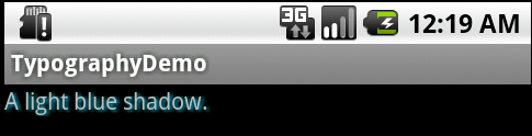
Text Shadow
You can use three different attributes to customize the appearance of your text shadow:
- android:shadowColor Shadow color in the same format as textColor.
- android:shadowRadius Radius of the shadow specified as a floating point number.
- android:shadowDx The shadow’s horizontal offset specified as a floating point number.
- android:shadowDy The shadow’s vertical offset specified as a floating point number.
The floating point numbers don’t have a specific unit – they are merely arbitrary factors.
- <TextView
- android:layout_width="fill_parent"
- android:layout_height="wrap_content"
- android:text="A light blue shadow."
- android:shadowColor="#00ccff"
- android:shadowRadius="1.5"
- android:shadowDx="1"
- android:shadowDy="1"
- />
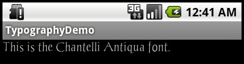
Using Custom Fonts
Lastly we’re going to examine the process of using custom fonts. We’ll use this font for demonstration purposes. Download it and place the TTF file in the ./assets directory (create it if it doesn’t exist yet).
We’re going to use a basic layout file with a TextView, marked with an id of “custom_font” so we can access it in our code.
- xml version="1.0" encoding="utf-8"?>
- <LinearLayout xmlns:android="http://schemas.android.com/apk/res/android"
- android:orientation="vertical"
- android:layout_width="fill_parent"
- android:layout_height="fill_parent"
- >
- <TextView
- android:id="@+id/custom_font"
- android:layout_width="fill_parent"
- android:layout_height="wrap_content"
- android:text="This is the Chantelli Antiqua font."
- />
- LinearLayout>
Open your main activity file and insert this into the onCreate() method:
- TextView txt = (TextView) findViewById(R.id.custom_font);
- Typeface font = Typeface.createFromAsset(getAssets(), "Chantelli_Antiqua.ttf");
- txt.setTypeface(font);
The Typeface class contains a static builder method createFromAsset, which takes an AssetManager as its first parameter and a path to the file in the second argument. We’re handing it the default asset manager and the name of the font file because it’s located in the root of the “assets” folder. Once we’ve got an instance of our custom typeface, all that’s left is a call to TextView’s setTypeface() method. Simple, huh? It might also be wise to organize your fonts into a subdirectory if your assets directory is packed with other files.
There are a few potential problems that custom typefaces come with, though. Ellipsizing might not work correctly if the font doesn’t have a glyph for the special ellipsis character and internationalization might not be supported, as your font would have to handle any language that users might input. You’ll also want to keep an eye on the total size of your custom fonts, as this can grow quite large if you’re using a lot of different typefaces.
Conclusion
This quick tip has shown you the different options that are available to you for customizing default Droid fonts. You have also learned how to include and use custom typefaces in your application. Just remember to ensure that any custom font you may be using has a license that grants you permission to use it for these purposes!
Suscribirse a:
Entradas (Atom)